
“We build your visions… with perfection.” One promise, two languages, every surface a contractor touches.
GAMA Construction: a brand that earns trust before the first brick
GAMA Construction · Construction
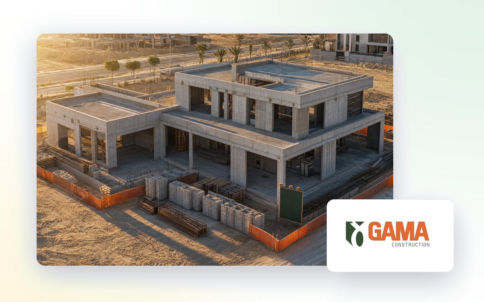
GAMA Construction, part of Triangle Group, needed an identity as solid as the buildings it puts up. We designed the logo, the colour and type system, the bilingual tagline and a 23-page brand manual, then carried it across two sub-brands, two pattern systems and every document a contractor hands a client.
Results, from the case record
Brand manual
Sub-brands built on the system
Languages
Logo pattern systems
In construction the logo is often the first thing a client sees: on the hoarding, the site sign, the tender and the contract. GAMA Construction, part of Triangle Group, wanted a brand that belonged on all of them, and one that could stretch to the group's other companies without starting again.
We built the identity on three colours, each with a job. Green for growth, safety and the environment. Orange for energy and determination, the colour of a working site. A formal grey to hold the two together. Poppins carries the logo and the tagline, Avenir Next carries the reading, and GE SS sets the Arabic.
The tagline works in both languages: “We build your visions… with perfection”, and in Arabic, نبني رؤيتك… بإتقان. It is the promise every other piece of the brand has to keep.
The system extends to GAMA Infrastructure and GAMA Building Materials, locks up cleanly with Triangle Group and with joint-venture partners, and runs on two logo patterns. The 23-page brand manual covers the rest: clear space, minimum sizes and the mistakes to avoid, plus business cards, letterheads, envelopes, the corporate folder, staff IDs, invoices, contracts, memos, email signatures, office walls and giveaways.
Delivered in July 2024 under Switch Creation, the studio Aurex grew out of.